Working with and supporting dark mode is fun. However, it's not just for fun, it's a feature, and some may even say it's a necessity.
This post will focus on how I implemented dark mode support in this website. Click on the top right toggle on this page to see it in action. 😃
Here is the GitHub repo jec-11ty-starter if you prefer to read the code straightaway.
What are the requirements?
Our website needs to support dark and light mode. I will refer them as color scheme from here onwards.
Here are the requirements:-
- Display the page with the user's preferred color scheme. (e.g. if the user's system settings is dark mode, our site should show dark mode as default).
- Option to change the color scheme - in our case, show a toggle on the top right corner.
- Once the user has changed the color scheme, we will use that setting for the entire session (until the user closes the tab). We will use session storage for that.
- Ensure smooth transition when changing the color scheme.
- Dim the images' color when it's in dark mode.
- In case no color scheme is detected, always fall back to light mode.
First things first, how to test this?
Before we jump into coding, let's talk about how we can test color scheme changes. We will be spending a lot of time on testing this.
Here is the guide on how to change the color scheme in your system settings:
However, changing our system settings multiple times is not fun. There's an easier way to do it: Chrome DevTools (CDT) is here to the rescue. We can emulate the color scheme with CDT.
There are two ways to do this - the short version (if you remember the command) and a slightly longer version.
Short version
- Open Chrome DevTools
- macOS ⌘+Option+J
- Windows Ctrl+Shift+J
- Right click on page > Select "Inspect"
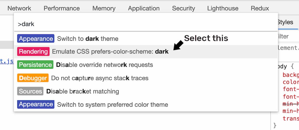
- Run command
- macOS ⌘+Shift+P
- Windows Ctrl+Shift+P
- Click on three dots (top right corner) > Select "Run command"
- Type in: "dark" (or "light")
- Select Rendering: Emulate CSS prefers-color-scheme: dark
Slightly longer version
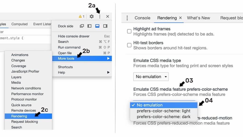
- Open Chrome DevTools.
- Pull out the Rendering Panel:
- Click on three dots > More tools > Select "Rendering"
- Click on three dots > Run command > Type "render" > Select "Show Rendering"
- Scroll down, look for the option Emulate CSS media feature prefers-color-scheme.
- Change the dropdown value to light, dark, or no emulation.
Detecting user's preferred color scheme
When the page first loads, we will use JavaScript to detect the user's current system settings.
We will also detect if any color scheme is stored in session storage. We will use that if it exists, else we use system settings or fall back to light mode if not found.
This logic is needed in every web page so we will place the code in the base layout. Here is the implementation.
// src/_includes/base.layout.js

{
  function init() {
    const DARK = 'dark';
    const LIGHT = 'light';
    const isSystemDarkMode = matchMedia &&
        matchMedia('(prefers-color-scheme: dark)').matches;

    let mode = sessionStorage.getItem('jec.color-scheme');

    if (!mode && isSystemDarkMode) {
      mode = DARK;
    } else {
      mode = mode || LIGHT;
    }

    if (mode === DARK) {
      // we will do something later
    }
  }

  // run the code
  init();
}
window.matchMedia (or just matchMedia) is the web API for finding out whether a media query applies to the document or not. It is widely supported by modern browsers. We can use that to detect prefers-color-scheme, which is the user's system setting.
When the color scheme is dark, we need to update our website appearance. We will look into that in a moment. No action is needed for the light color scheme, because it's the default mode.
Creating the color scheme toggle
We use an image as toggle. Place it in base layout too because we want it to show in every page.
<!-- src/_includes/base.layout.njk -->

<img id="color-scheme-toggle"
  src="/assets/img/icons/dark.svg" alt="toggle dark mode" />
We gave the toggle an id #color-scheme-toggle. We will change the image src to "light" and alt to "toggle light mode" if the user clicks and toggles to light mode, and vice versa.
Note that you can replace the image with your own dark and light mode images. It is okay to use text buttons too.
We will handle the toggle click event in a moment.
How do we style for each color scheme?
We will style our website by using these two approaches:-
- Split into light and dark CSS files, and load them conditionally. In our case, we will toggle between these 2 stylesheets for syntax highlighting -
prism-dark.cssandprism-light.css. - Append a CSS class in the HTML
bodytag when the color scheme has changed. In our case, we will append thedark-modeCSS class in thebodytag when it's in dark mode.
<!-- src/_includes/base.layout.njk -->

<html>
  <head>
    <!-- Not every page need syntax highlight -->
    {% if prism %}
      <link id="prism-css" rel="stylesheet"
        href="assets/css/prism-light.css">
    {% endif %}
  </head>
  <!-- we will toggle the dark-mode CSS class -->
  <body class="">
    ...
  </body>
</html>
/* src/_includes/base.layout.css */

body {
  background-color: white;
  color: black;
}

body.dark-mode {
  background-color: black;
  color: white;
}
What happens when the toggle is clicked
When the user clicks on the color scheme toggle, we need to:
- toggle the body tag's dark-mode CSS class
- update the jec.color-scheme session storage key
- update the #color-scheme-toggle's
srcandalt - update the #prism-css
hrefif it exists
We will also fire a custom event. Let's name it "colorSchemeChanged" because we want to decouple the page specific changes.
For example, my profile photo in home page changes when the color scheme changes. It is specific to that page, and I don't need that logic in other pages.
By firing a custom event, each page can listen to the event and implement page specific updates independently.
Here is the code.
// src/_includes/base.layout.css

{
  const bodyEl = document.body;
  const toggleEl = document.querySelector('#color-scheme-toggle');
  const prismEl = document.querySelector('#prism-css');
  const DARK = 'dark';
  const LIGHT = 'light';
  const COLOR_SCHEME_CHANGED = 'colorSchemeChanged';

  toggleEl.addEventListener('click', () => {
    const isDark = bodyEl.classList.toggle('dark-mode');
    const mode = isDark ? DARK : LIGHT;
    sessionStorage.setItem('jec.color-scheme', mode);

    if (isDark) {
      toggleEl.src = toggleEl.src.replace(DARK, LIGHT);
      toggleEl.alt = toggleEl.alt.replace(DARK, LIGHT);
      if (prismEl) prismEl.href = prismEl.href.replace(LIGHT, DARK);
    } else {
      toggleEl.src = toggleEl.src.replace(LIGHT, DARK);
      toggleEl.alt = toggleEl.alt.replace(LIGHT, DARK);
      if (prismEl) prismEl.href = prismEl.href.replace(DARK, LIGHT);
    }

    toggleEl.dispatchEvent(new CustomEvent(
      COLOR_SCHEME_CHANGED, { detail: mode }
    ));
  });
}

{
  // init...
}
If you want to learn more about custom event, here is the documentation of Custom Event API by MDN.
Next, we can update our init function from just now. Trigger the color scheme toggle click event when it is in dark mode.
// src/_includes/base.layout.css
...

{
  function init() {
    ...

    if (mode === DARK) {
      // add this line
      document.querySelector('#color-scheme-toggle').click();
    }
  }
  ...
}
Handling page specific changes
Here is an example on how you could listen to the colorSchemeChanged custom event. We will update our profile photo's src on the home page when the color scheme changes.
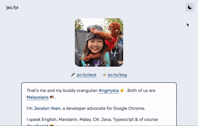
Prepare two profile photos, one for light and one for dark mode. Here is the HTML:
<!-- src/root/index.njk -->

<img id="profilePhoto" src="assets/img/me-light.jpg">
Here is the code:-
// src/root/index.js

{
  const toggleEl = document.querySelector('#color-scheme-toggle');
  const DARK = 'dark';
  const LIGHT = 'light';
  const COLOR_SCHEME_CHANGED = 'colorSchemeChanged';

  toggleEl.addEventListener(COLOR_SCHEME_CHANGED, (e) => {
    const isDark = e.detail === DARK;
    const imgEl = document.querySelector(`#profilePhoto`);
    const mode = [DARK, LIGHT];

    if (isDark) mode.reverse();
    imgEl.src = imgEl.src.replace(mode[0], mode[1]);
  });
}
Dim the image's colors for dark mode
Sometimes, the image's colors might be too bright when displayed on a dark background. We can adjust the image colors with CSS.
This website applies the CSS below for all images:
.dark-mode img {
  filter: grayscale(30%);
}
Smooth transitions when changing color schemes
It is good to change the color schemes gradually, providing users with visual feedback and a pleasant experience. This site applies background color transitions when the color scheme changes.
/* src/_includes/base.layout.css */

body {
  background-color: white;
  color: black;
  /* add this line */
  transition: background-color 300ms ease-in-out 0s;
}

body.dark-mode {
  background-color: black;
  color: white;
}
Bonus: Use the ready-made web component
The Chrome team has developed a custom element that allows you to easily insert the Dark Mode 🌒 Toggle on your site.
Take a look at the documentation, NPM install and use it right away... without having to write the most of the custom code above.
# command

npm install --save dark-mode-toggle
This web component is used in the V8 blog. (TLDR - V8 is the JavaScript engine, used in Chrome and Node.js.)
You might be wondering why I did not use that? It is because I only found out after I have shipped my code. 😆
Since my implementation is decent for my scenario, I'll just continue to use mine.
[Updated: Dec 6, 2020] Oh, receiving several requests, I've updated my site to save theme preference in localStorage for longer persistence.
Alrighty, what's next?
Yay! Dark mode is proudly supported in our website. 😍 Here's the GitHub repo for the code above: jec-11ty-starter. I'll update the repo whenever I write a new post.
If you need a more detailed guide on dark mode in general, including its history, I recommend you to read this article - Hello darkness, my old friend by my colleague Thomas Steiner.
In the coming posts, I plan to write about more on how I built my website with 11ty:
- Building Personal Static Site with Eleventy ✅
- Setting up GitHub Actions and Firebase Hosting ✅
- Customizing File Structure, URLs and Browsersync ✅
- Automating Image Optimization Workflow ✅
- Setting up SEO and Google Analytics ✅
- Minifying HTML, JavaScript, CSS - Automate Inline ✅
- How many favicons should you have in your site? ✅
- Creating Filters, Shortcodes and Plugins ✅
- Supporting Dark Mode in Your Website ✅
- and probably more!
Let me know if the above topics interest you.
That's all. Happy coding!
Have something to say? Leave me comments on Twitter 👇🏼
Follow my writing: @jecfish